I was playing recently with techniques for making text/labels in maps more readable in a map. We can use simple buffers to do this, but this isn’t always adequate. Take this example:

which is a label on top of contours. It is adequately readable. If we show 2 ft contours as well, the map becomes somewhat cluttered:
So, we apply the common technique of halo or buffer, which in this case we’ll do in QGIS:

and so we get an adequate result:

If we color the halo the same as our background color, we achieve a subtle but effective result:
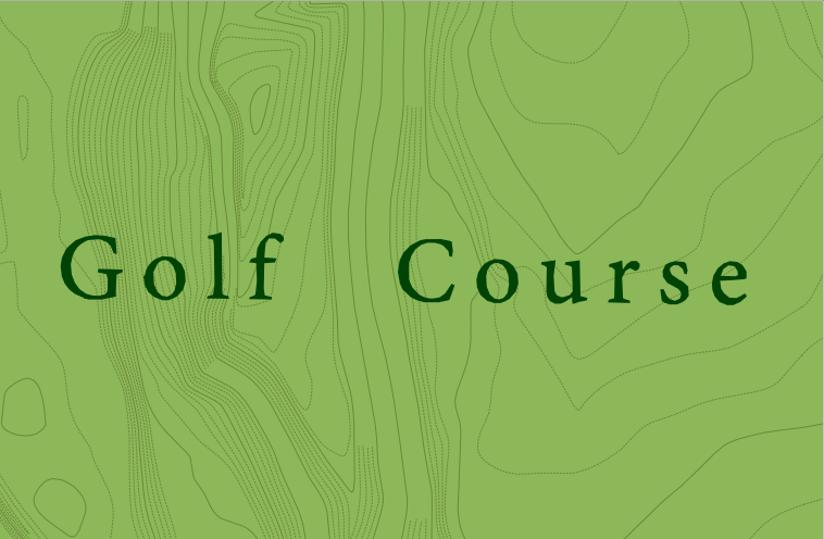
 Overall, I’m pretty pleased with this result. But note the contour lines running through the “O” and “G”, etc. This would be more readable if we blocked more of the contour linework. Enter convex polygons:


Overall, I like this effect a lot. It can be subtle but quite powerful. It would also may a nice addition to existing rendering pipelines as a labeling option, in middleware such as GeoServer, MapServer, or the Mapnik family.
 ——–>
——–>
Irony here– I’m absolutely awful at anything but mini-golf (putt-putt).

Nice one, Stephen. Kinda like an “uber-halo”
I kind of like the uber halo. I think it’s closer to some of the tricks the ink and pen folks used… .
Another idea – you could buffer the convex hulls to provide the halo effect directly.
That’d be a nice way to chain it, skips a union which is good.