Guest blog post today from Brandon Garman (@brandon_garman):
After seeing Mapzen’s blog post on Sphere Maps, I wanted to try my hand at it. I downloaded the Github repository, set up a python simple server and ‘BOOM’ had my own instance running (Mapzen makes this process very easy). So next I pulled out my Wacom tablet, opened up Photoshop and began painting in circles with different colors and brushes. After I had a few results I was happy with, I loaded each one to see how I did. Not so well it turns out! I need to spend a bit more time practicing and fine-tuning before I can get any results half as nice as Mapzen’s examples.
Instead of hunkering down and refining my painted circles, I took a look at some of the non-hand drawn examples that came in the repo (glich, yinyang, checkerboard). Since all that needs uploaded is an image file, I decided to find some images of my own. PLANETS!! What better image to use to style terrain on earth than other planets! So, I picked a few images of our planetary neighbors and I have to say I’m very happy with some of the results.
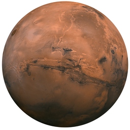
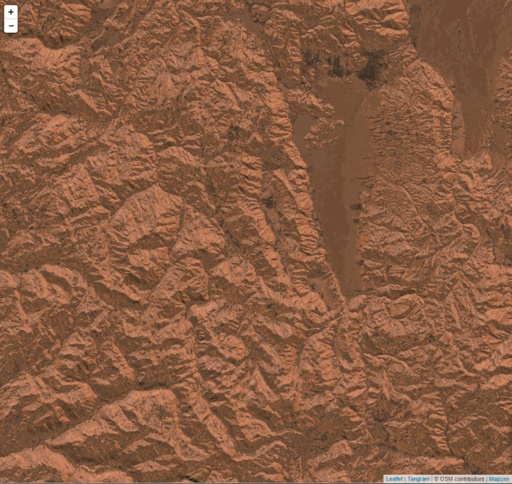
MARS
This is probably my favorite result (the moon is a close second though, see below).
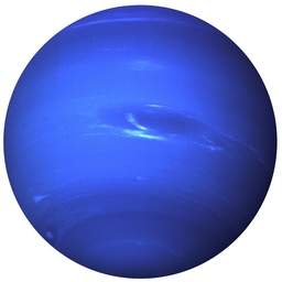
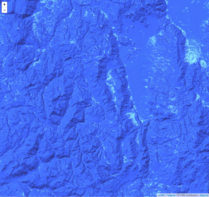
NEPTUNE
As a cartographer, seeing an all blue hillshade is jolting, but oddly amusing. Still an excellent result though.
MOON
There are some great colors and contrast here, however the result was a little blah.
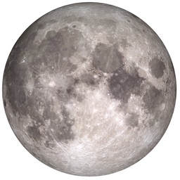

Until I realized the majority of the dark colors were in the top left, which meant the lighting was backwards from what is typical. So I rotated the sphere image 180 degrees and the result was much better, close to that of Mars.


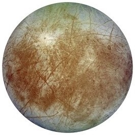
EUROPA – one of Jupiter’s moons
Not too bad, but has the same inverted look as the moon did.


Here it is rotated 180 degrees.

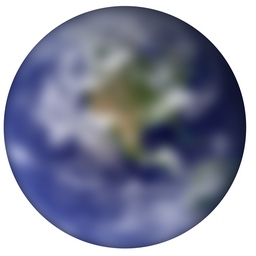
EARTH
Obviously I was going to use Earth. This color scheme here is really great, but the level of detail in the data at this scale makes it look pixellated and hard to read.
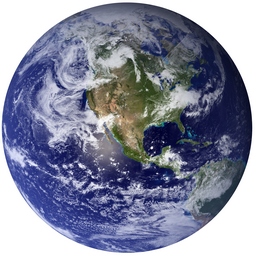
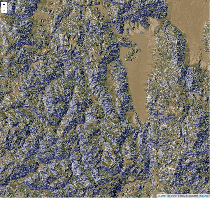
I tried blurring the image a bit to smooth out some of the choppiness of the colors and it helped.

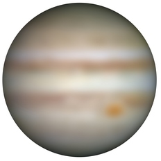
JUPITER
I love this color scheme as well, but has the same problems as the Earth image did.


I blurred this image as well. It helped a bit. Still a great color scheme though.

The best part about sphere map is that the only limitations are your creativity. The ability to create great looking maps is very easy. Also, the ability to create the most useless but entertaining maps is just as easy and is sometimes more fun…